Website Design & Logo Updates!
If you’ve been on the Spine recently, you may have noticed that things are very different now in terms of design. The Spine has has a pretty major face lift. I received some advice from a designer friend of mine, Kelly Rauwerdink, on The Spine of the Empire’s website design, mostly focused on the home page. There was a lot to take in and a lot to improve.
The Major Design Changes
The home page, save some copy, was gutted and redone. Change highlights:
- Added the first four book covers to the home page. You immediately know this is a book series.
- Redid/tweaked the copy so it calls out the books and characters first and foremost rather than about the world and the work that went into it (as that’s not something that attracts people!)
- The page was broken up visually by having some areas have a darker background rather than just white.
- Added an artwork slideshow to showcase the commissioned artwork. The Spine Representation art was also added to the side for texture.
- Combined the ‘About Me’ page into the home page at the bottom, and added a picture of myself. This page wasn’t that useful, so it no longer exists. Frees up the nav too!
- The Header now pops with the darker background and larger text. Ideally this was recommended to be like a hero image with artwork that represents the series. I don’t have that figured out yet so this is what it is in the meantime. I like it anyway.
The changes didn’t stop with the home page. Some other notable changes:
- The nav has been rearchitected so the logo/name is in the middle and the core nav links are around it.
- I condensed the colors used across the site. The blog shows this the most, the alternating colors have been streamlined and cleaned up. The electric blue core color is also used as an accent in more places.
- On hover, the entire blog card highlights rather than just the image area.
- I replaced the heading/header font with Exo 2. It fits the Spine vibe and feels more professional than the previous font.
- There is no more fractal background. The reasoning is that it made the site busy and distracted from the content.
New Logo!
Not only was the website design tweaked, I made a proper logo! The old triangle logo was, well, old, and not that good. I never liked it that much.
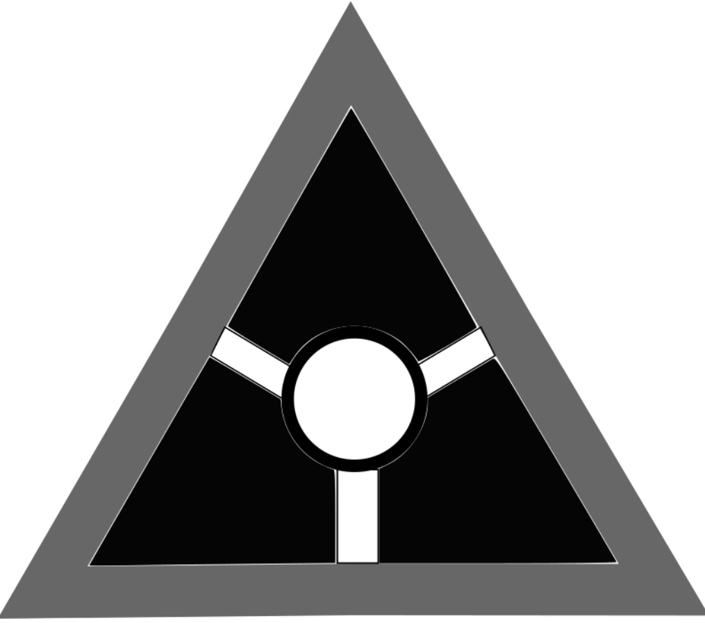
It didn’t convey the Spine to me. It was pretty much a placeholder that overstayed its welcome. With this desire to update the website to make it more enticing, I knew I had to replace it with something better. I wanted a logo that was The Spine itself and fit narratively and aesthetically into the website.
So I took to sketching out some ideas.
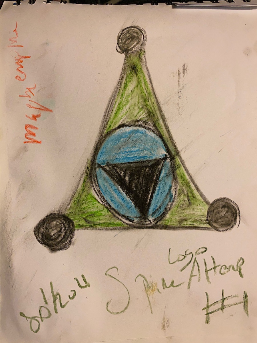
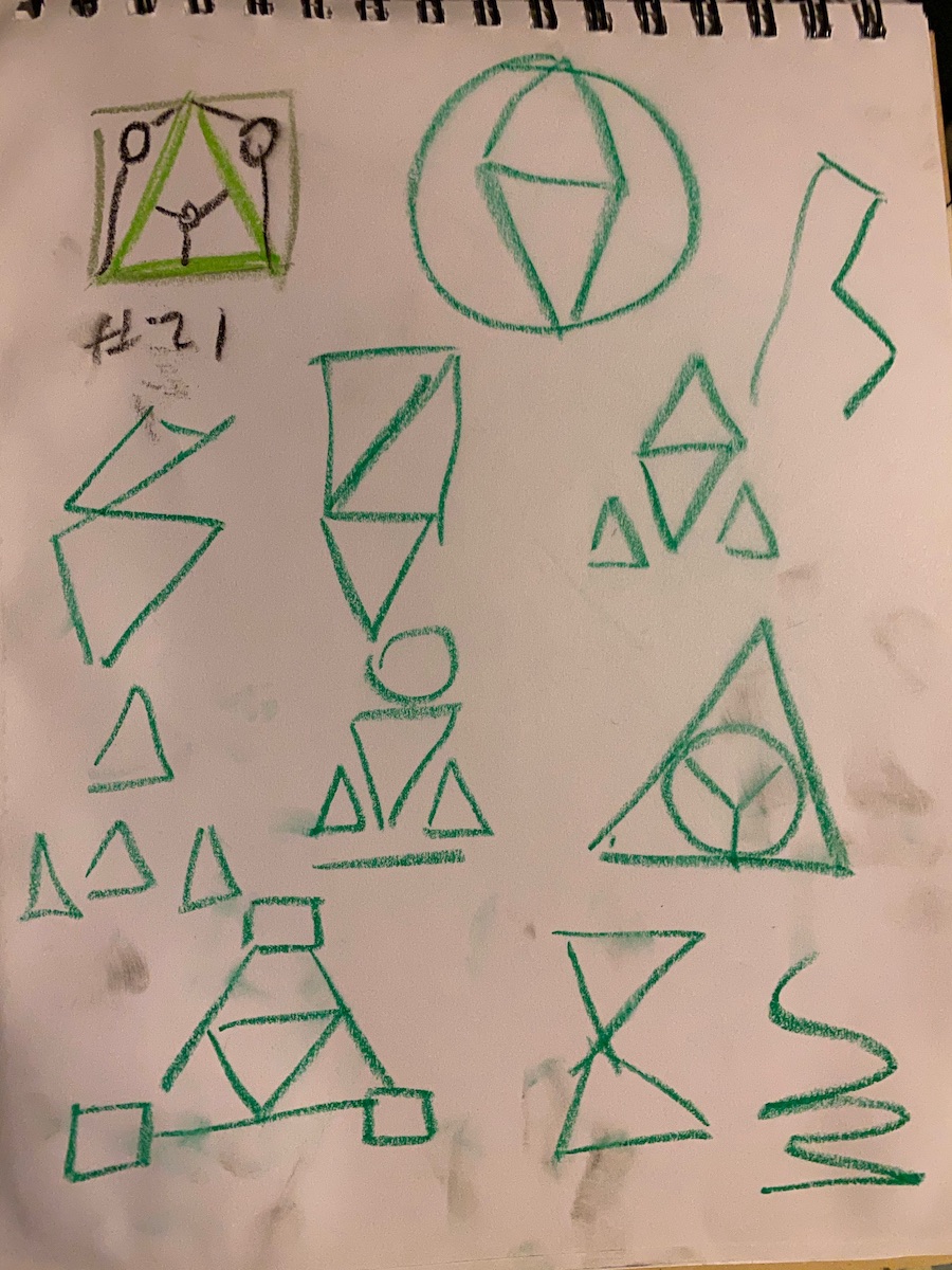
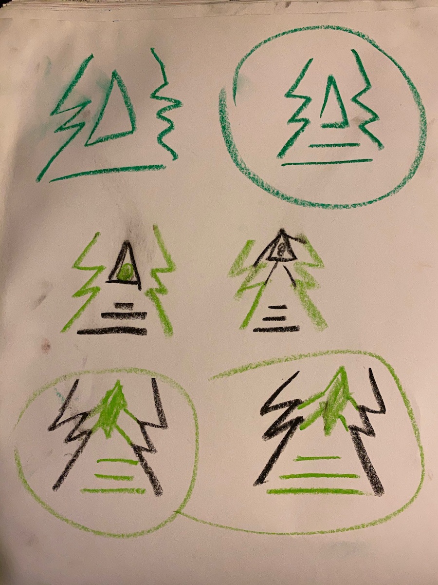
I started with keeping to the old triangle structure and just updating it to add more intrigue. A remix. It ended up feeling more Empirian than of the Spine. I kept going, playing with shapes. I wanted to incorporate lightning or electricity motifs since that’s the origin of the Spine. Which led me to a shape that is actually reminiscent of ‘The Tree’ character in Tyra Tarkush, which is even more apt since ‘The Tree’ is of knowledge. It felt so apt for the Spine to be like a techno-inspired ‘The Tree’.
Once that idea was locked in, I made a digital version with Sketchbook. But it was not a SVG. My designer friend instructed me how to use Figma to make a proper SVG of it. With that knowledge, I made a transparent white version and a black version on white background, depending on the context. Plus one with the site title, which you can see in the nav!
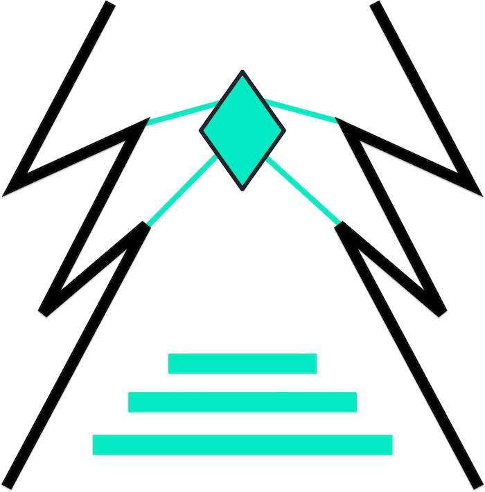
It looks so slick. I really like it. It fits in-universe and on the site. It does truly feel like the Spine’s icon.
Ending Thoughts
All together, these updates have made it so the site is far more effective at communicating my message and work. I feel so much more confident in it.
I am mulling over a few more updates, specifically whether to tweak the blog/page headers and to use the slideshow component in other areas. I may raise a Patreon poll or two about it.
But in the meantime: meet the new Spine!
Related/Recent Posts
The Lost Print Copy
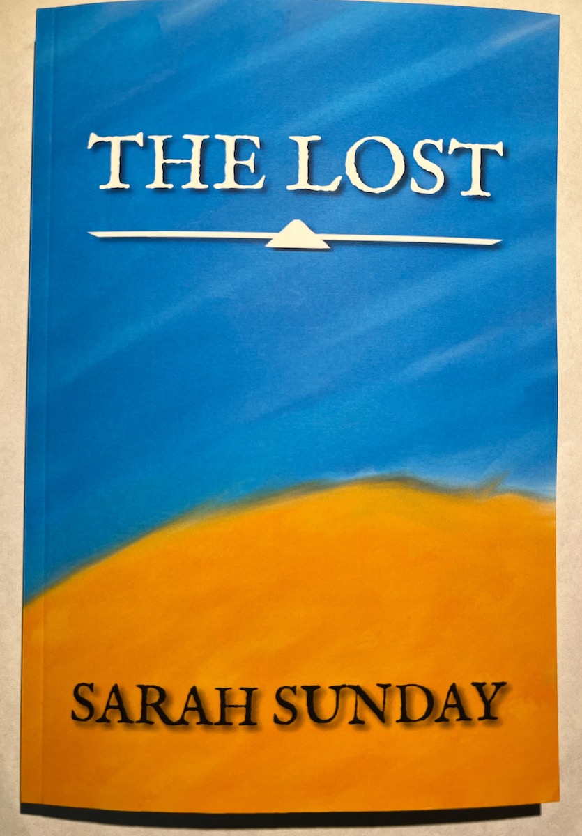
Finally The Lost in print form! It’s a slim 6x9 copy. The interior margins were too tight to the spine for my liking so I’ve adjusted it going forward. It is now up for purchase now on Lulu. I’m pleased with it. {% include image-gallery.html gallery=page.general %}
The Lost RELEASED!
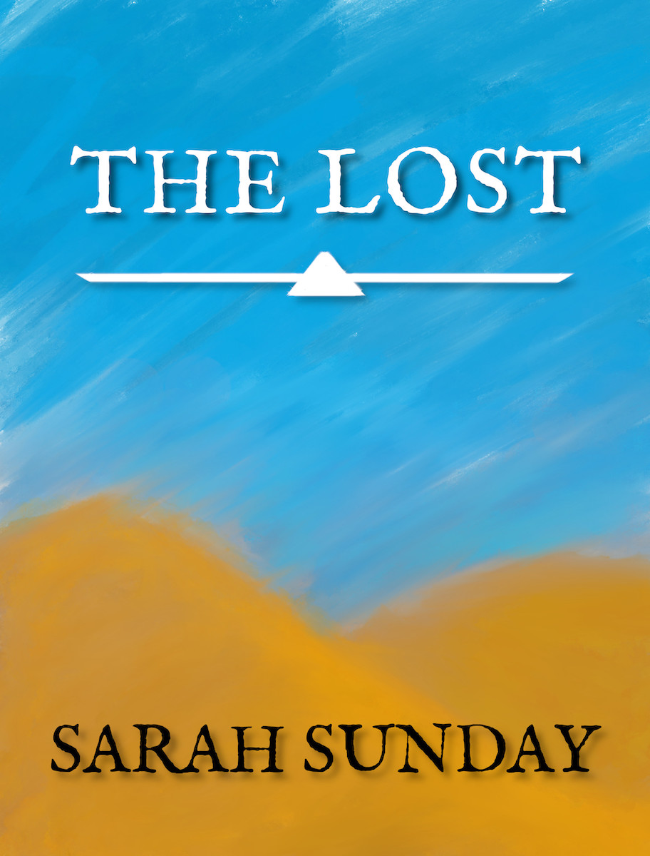
The Lost, my first ‘novella’, is finally done. After…like seven years of not really working on it, but always knowing I would, it is finally done. It feels good. I haven’t worked on / gotten the print copy yet, so that will be forthcoming.
