Commissioned Art of King Fla'neiel!
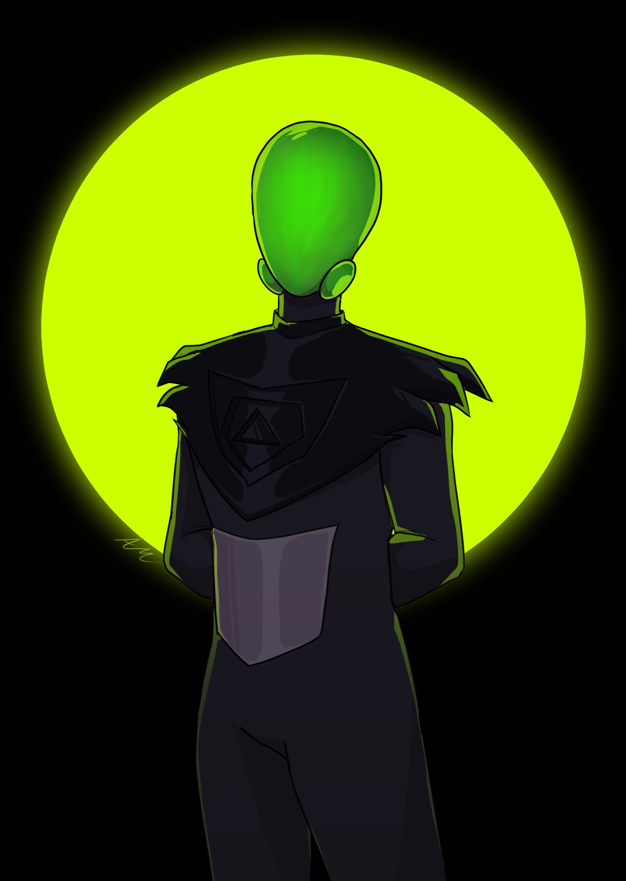
I went outside my comfort zone with this art commission! I wanted to try something a bit more cartoon-y compared to the other more moodier artwork I’ve had commissioned. And I really wanted to get King or one of the more armored/alien characters done. So I commissioned Malgamma for King Fla’neiel (after some back and forth of figuring that out, haha)!
The Process
It was pretty easy and straightforward, as I had a great deal of references for King in the pose that I wanted. I went with a half-body & full color, to showcase his head and mantle. And, some time later, Malgamma got back to me!

I’ll save my general comments for below…the only thing I requested change was the crease of his legs. It seemed too long, so I asked to shorten it to like 20% of what it was in the first go. That was a quick change so the final came back the same day!
Final & Conclusion
Breaking my thoughts out into two sections: my internally directed musings and the actual critique.
My Personal Takeaways/Questions
I thought I knew what King looked like…
The main thing that is confounding me is King’s body proportions and weight…is he ‘thick’ or ‘thin’? Looking at the art, I thought he was too thick, but then again, I never really thought about this at all. I don’t know if he’s thin either. What’s wrong with him being ‘thick’? I think Cyclone would appreciate it. Are Flana generally thicker or thinner? I feel like he should be thinner…but why? What are Flana, usually? I need to figure that out…
And that I need higher fidelity mental models when it comes to texture…the silver plate I’ve thought of as that, but I feel like it needs something. But. Does it? Why do I feel this way? It is exactly how I’ve drawn it and thought of it. Hmm. I think it is what it is, but I think it’s like, textural contrast of the metal and flesh. I need to think on textures.
Actual Critique
Comments actually related to the art and not my own poor mental picture:
- I love the radiating circle background thing.
- The smoky color waves on the helmet are cool, but I think the shape needs to be more uniformly curved (like not come to a point). My TODO is lock down the helmet shape and draw it out.
- Pose is spot-on. He looks kingly.
- I think the skin tone is great.
- He looks pretty alien, all things considered, when actually looking at him with proper coloring. So that’s awesome!
- The mantle looks generally right shape wise, but I think texturally it’s off somehow, but I can’t say why so this also goes under ‘my takeaways’ for texture.
Conclusion
This has raised a lot of questions for me on King’s physique and textures in general. I don’t have the answers, but it’s something I am mulling over and I expect to get feedback on when I post this on Patreon.
But, anyway, it was great working with Malgamma on bringing King Fla’neiel to life! He looks good!
Related/Recent Posts
Crochet Balon
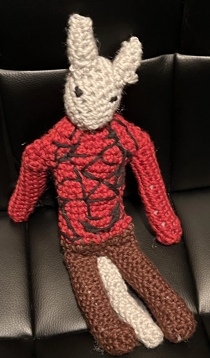
I have finally made another crochet character, this time of Balon. I based the process roughly off of the Chatzu’kuan crochet. I didn’t take proper notes of what I did differently or in general. I made Balon smaller in scale than Chatzu’kuan. She’s kind of buff looking.
September 2024 in Art
Various pieces of art for/from Volume 2. Played with some new styles and brushes. I overall like the results.