Commissioned Art of King in an Action Pose!

Now that the Zfnoctewoohi family is done (for now), I was free to pursue other commission ideas. I wanted to have another core cast member done by Erika Hollice. This was narrowed down to either King or Cyclone and my Patrons voted for King!
This was even though King already been done by another artist, Malgamma, late last year. It was a simple piece of him just chilling. And it was more of a cartoon-y style. This time, I was interested in seeing something dynamic with King that also showcased his awesome sword and lightning powers. It would also be in the same style, obviously, as Balon, Rayacha Chajaran, and other members of the Zfnoc/Zfhi lines as Erika would be drawing him!
I was debating on having him fully armored but wasn’t that into it. I also didn’t have a fantastic mental design for what the armor looked like when it fully covered his body. I still don’t!
The background I sort of wanted to be nebula-esque. Something that felt like it could be a scene in a future story. As for the pose, I provided some references/ideas…and then we were off!
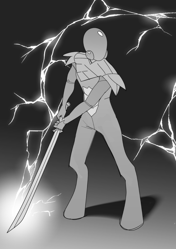
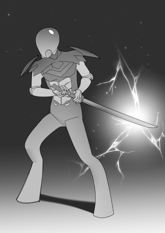
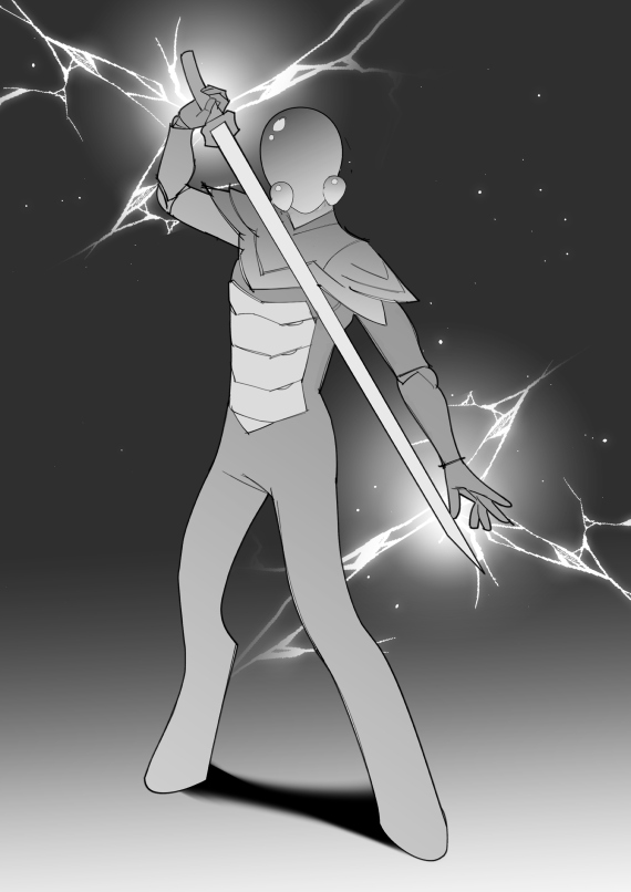
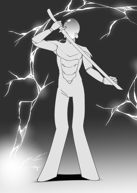
Poses
It was so cool seeing the four poses Erika provided as I think there’s less than a handful of pictures I’ve drawn like this. It felt new and fresh seeing King done in this way. And coherently (as in, by someone who understands perspective, haha).
There were a few elements of each that had to be like chosen as the way to go:
- The legs: King’s legs don’t have a jointed knee and are sort of frozen/angled. #4 looks like how I draw them, but #3 looks more…realistic.
- The chest plate: #1 was it because it was smooth and simple.
- The mantle (the armor piece by his neck): #2 looked the best, but needed to be fused with #1 a little. The jaggedness was very cool in #2.
Asides from that, pose-wise, #1 + #2 were my favorites. I did really like the charging effect going on in #3 and it gave my mind some ideas on how to describe combat scenes going forward with him. I liked the lightning arc of #4 too.
But #1 + #2 seemed more like King. #1 especially. He seemed sort of tired yet also ready to go. Which is totally King. So that was what I decided upon.
Preview
And…COLOR!
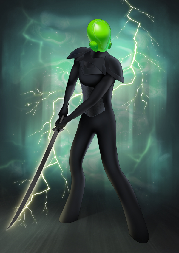
The background is so good. It was not color-wise what I was thinking, but that doesn’t matter since it looks so cool and more thematically aligned with King. So murky and textured…gets the ideas flowing. And the lightning effect! It feels so realistic. The sword looked great and so did the chest plate details. His skin tone was on point.
However, there were some core things that needed tweaking on the main aspects of King:
- The helmet needed to be like smooth rather than having that like traced through on it.
- The space between his mantle and his chest plate needed to be dropped. Longer mantle and shorter King, basically. It looked weird with that space.
- The mantle needed to have like layers on the shoulders and the armor needed to be tighter to his neck. It was too smooth.
Basically, it was helmet/mantle related, which are probably the most iconic aspects of him. I was very knee-jerk in my reaction to it since King is so close to my heart…but it all worked out!
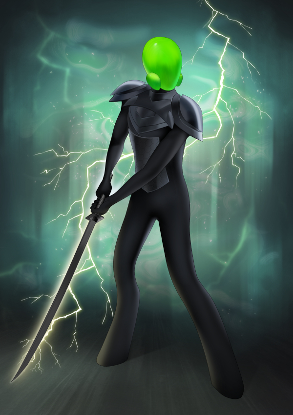
Erika came back with the revised preview that fixed those core issues! It looked good to go (except a few things I had to figure out myself, which I’ll go into below).
Final

Woohoo! That’s King, his lightning, and his sword. It looks great, though, there are definitely aspects that I think aren’t true to my mental image (though, it is growing on me). I know what feels right, but I don’t know what right exactly is. I can’t fully articulate what they ought to be, but here they are:
- The mantle design. It needs to be ‘spikier’ and have more layers on the shoulders. I really need to lock down what this looks like.
- The mantle texture, I think, needs to be more cast-iron or coppery. I need to find some metal or something as an example of this since I can’t think of anything real world right now.
- Arm thickness relative to torso. His arms feel a bit thin, but I kind of want to play around with arm thickness in my mind and see what makes sense.
Asides from those three points, something I’m still trying to rationalize is like bridging the gap from my more cartoon-y or ‘flat’ mental image to a more realistic interpretation. Like how should his skin really look? How thick should the lightning be…I imagined it more like…thicker…but would it really be? The quality of the metal. And so on. I don’t have answers for any of this, just new questions.
Anyway, it is really fantastic seeing like this more realistic interpretation of King and his design. It helps me figure out what I need to figure out and that is priceless. Erika did a great job as always bringing my character to life! I’m excited to see the other major characters come to life this way and to iterate on their designs like this.
Related/Recent Posts
September 2024 in Art
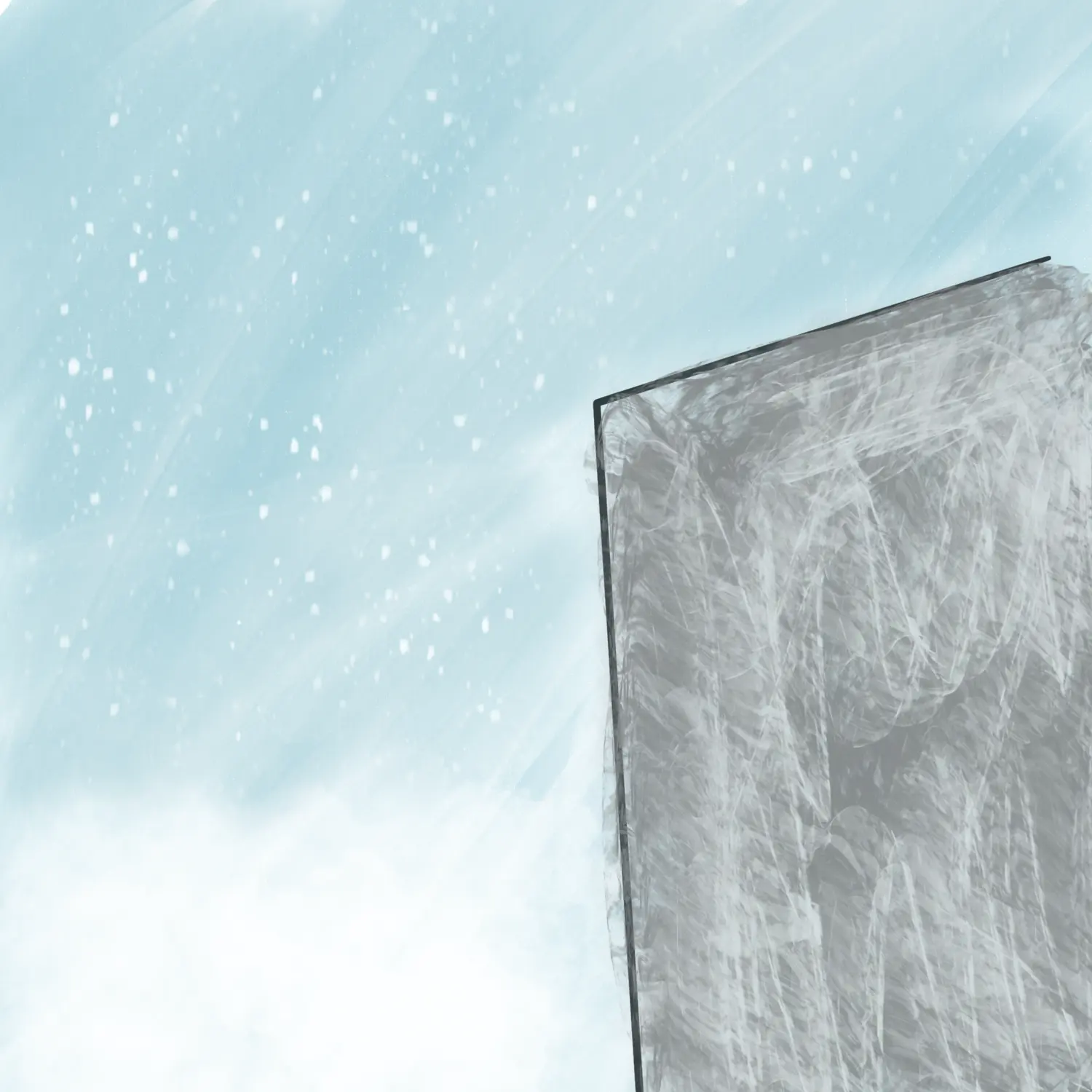
Various pieces of art for/from Volume 2. Played with some new styles and brushes. I overall like the results.
Crochet Jurak
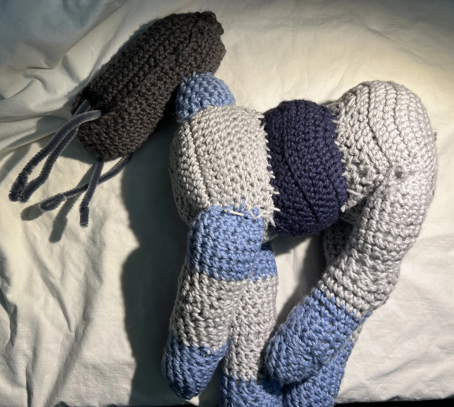
The crochet Jurak I made is BIG. I didn’t intend for him to be this big, but I’m bad with scale. As a result, he was hard to photograph. He was a beast to make too! Like with Chatzu’kuan, I took terrible notes/steps. I think what I consider BLO is actually FLO…so asterisk with that if you are trying to follow my instructions. {% include image-gallery.html gallery=page.gallery class=”half” %} Back legs Mr 4 Inc 4 Inc 2 sc 8 Inc...

