Expansion Expression Cover
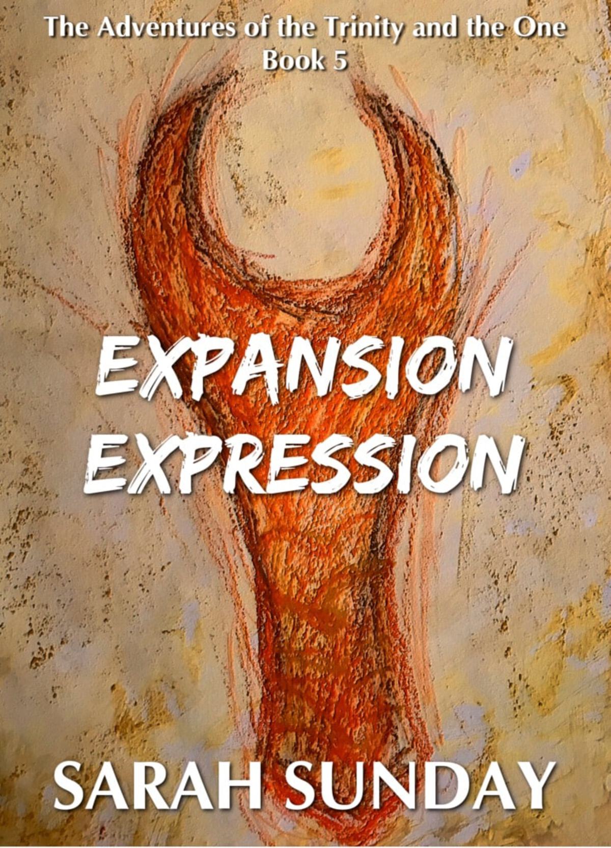
I bring to you what I've mocked up as the e-cover for Expansion Expression (Book Five). It's very minimalist–most of the power comes from the art. Like How to Stop Wildfire.
The process of how I made this one:
To start, I used water colors to give the paper a yellow-y-coppery background. Then, once it dried, I took oil pastels and sketched out the 'Scorpion' (the orange pincer). I used two different types of pastels and I smeared them all a little bit. After that settled, I made these little flicks off to the sides of it with a colored pencil and pastel. I scanned it in and did some color balance modifications with GIMP in addition to adding a Bump Map.

The title text was added and moved around many times. I tried putting it in different places that weren't necessarily centered. The series title/my name are further up/down than in the others as I was trying to feature the art as much as possible. But for the title I gave up as it was supposed to be 'blaring' in a way. The font is 'Edo', if anyone is wondering.
Result:
It might be the most literal of the covers. No, it pretty much is. That's going to be the style for 5-8. Each cover will depict a sort of cave-art style depiction of the Primordial Essences. This one is the Scorpion. It has been abstracted as Essences do not truly come in the complete form of what they take form as. They are the vague outline of it. The most vaguest notion of the creature transformed into a vessel for the idea of the Essence that they are.
In my imagination of these covers, they were going to be very similarly styled. They would all have the same sort of background and seem to 'flow' into each other. I don't know if I can completely attain that consistency, but rest assured, they will all be this type of aesthetic.
Well. That's it for now.
Related/Recent Posts
The Lost Print Copy
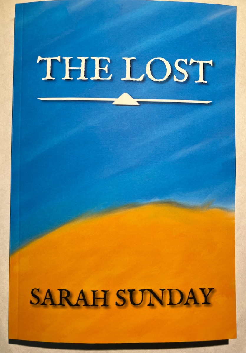
Finally The Lost in print form! It’s a slim 6x9 copy. The interior margins were too tight to the spine for my liking so I’ve adjusted it going forward. It is now up for purchase now on Lulu. I’m pleased with it. {% include image-gallery.html gallery=page.general %}
The Lost RELEASED!
The Lost, my first ‘novella’, is finally done. After…like seven years of not really working on it, but always knowing I would, it is finally done. It feels good. I haven’t worked on / gotten the print copy yet, so that will be forthcoming.