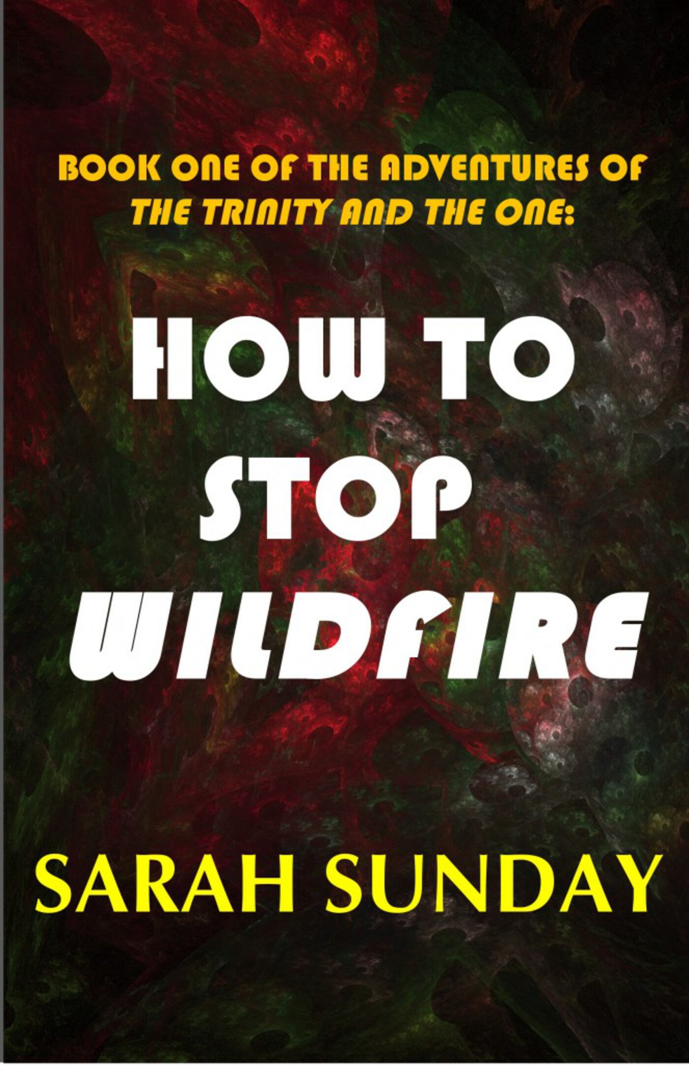
Book Cover Design: The Struggle is Real
Book cover design is a ridiculously important part of the self-publishing process. The book cover design is important to attracting readers. Readers, although they are named such, don't read the blurb or first few pages to decide if they want to read your book, they just look at the cover. I am guilty of this, so I am not complaining. It is just how we as Humans operate.

Because of that we have to make something that somehow explains the 80k+ words in your novel in a picture and a few words. Design something that explains it all by various techniques. Color blocking. Masking. Layers. Typography. Layout. Madness! How book cover design people do their work is unknown to me. It is like some form of black magic that I am forced to dabble in.
My first cover used to be pretty bad. Crap, actually. So bad I am terrified of showing it to the world. But I linked to it anyway because I am strong. I knew it was bad but I was just scrambling to get it OUT. Because I had this imaginary deadline that I wanted to subscribe to. DON'T BELIEVE THAT. Only launch when YOU are ready.
So eventually after learning my lesson I decided to rectify my mistake and make a new, better cover.

I think it looked pretty legit. But my opinions are worthless. They change. And I realized that it looked...kind of bad.
So I endeavored to change it. But I have zero design skills so I required help from the great community of G+ and Goodreads.
Through conversations lasting hours and mocking and re-mocking I was able to create designs that blew the old one away. To see the evolution go to my GPhotos Collection. It was pretty intense. I learned a lot on typography, proximity, and using the space more effectively.
The main style rift was setting the title on the top or the bottom.


Both were vastly superior to what I had, but I had difficulty choosing between the two. The on the left had more going on, with the black box, but it was also more disjointed. The one on the right, however, was more cohesive and easier to read in my opinion. I also liked how the petals were showed off more effectively.
In the end I chose the right one.
Then I had to go back and re-do the print cover for it, because I like a consistent design aesthetic. This was actually a good thing for me to do, because the print version had problems that I needed to fix.
I changed the fonts to match the ebook and made things bolder. I brought the title/author/subtitles closer together to give more exterior empty space. Easier to read, considering the book is physically large.

So yea, there it is. The changes are going live and I am very happy with the end result. I think the new covers are more eye-catching than the previous iterations and better define the novel.
Some key points I learned:
- Typography - this matters the most. A terrible font will confuse people and make reading the title difficult.
- Layout - make it easy on the eyes. Don't be cute. I suggest putting the series name after the title, because it seems more logical to the reader. Make sure title takes center stage, unless you are an established/popular author (then why are you reading this?)
- Proximity - don't make things too tight or too far away. A problem I had with the print cover is spacing the subtitle to the title. If I went too far, they did not seem related, and too close together made the author line seem chocked.
Conclusion:
Don't be hasty with book cover design. Take time and think carefully about your choices.
Related/Recent Posts
Spellbinder Character Development Spotlight
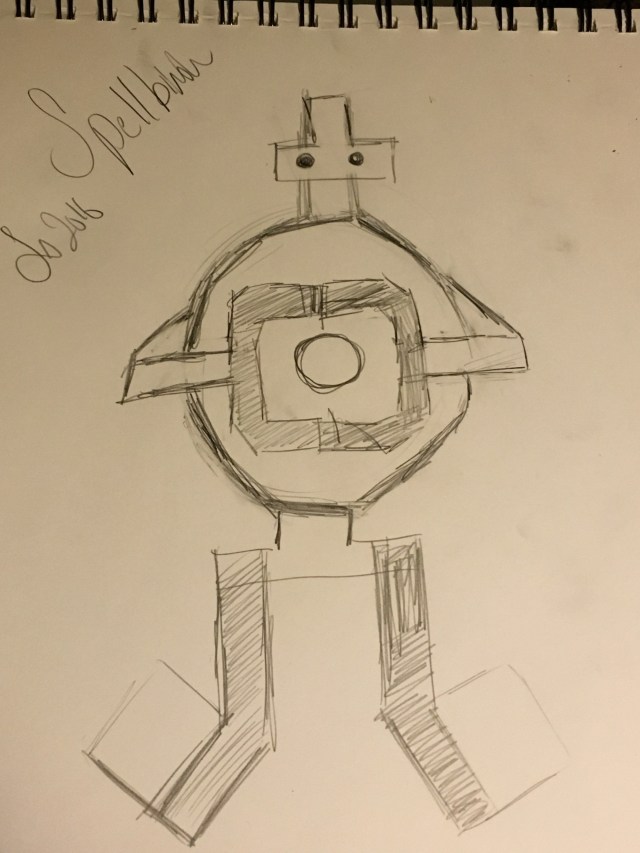
This is less going to be a character development post for Spellbinder but an analysis into her character, both meta and not. Personality, physical form, how she fits into the team, and so on. I don’t have much else to introduce with so let’s get started diving into her being.
April 2022 in Art
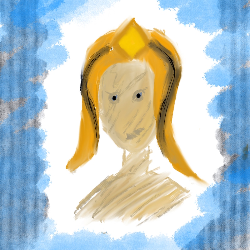
Here is the art I did in April 2022, which is only two busts of characters from The Lost. Very pleased with Pharaoh’s art. Her expression…I don’t know, it just enchants me and makes me think. Tiger could have been better, but Tiger’s a hard one to nail since he needs to be uncanny and I’m not adept enough to do that. {% include image-gallery.html gallery=page.gallery class=”half” %}